Education Career Discovery Microsite
Microsite in Collaberation with Make A Future

About this project
This project reimagines career discovery by guiding youth from interests to action through a clear, engaging microsite.
What is Make A Future?
Make a Future is my practicum host and B.C.’s official education career job board connecting job seekers to opportunities
The Challenge
the recruitment challenges for Make a Future is that youth are not entering education sector.
Enticing secondary students to enter the field is a way to get ahead of the demand for hard-to-fill roles, while also raising awareness about careers in teaching in general.
Outcome
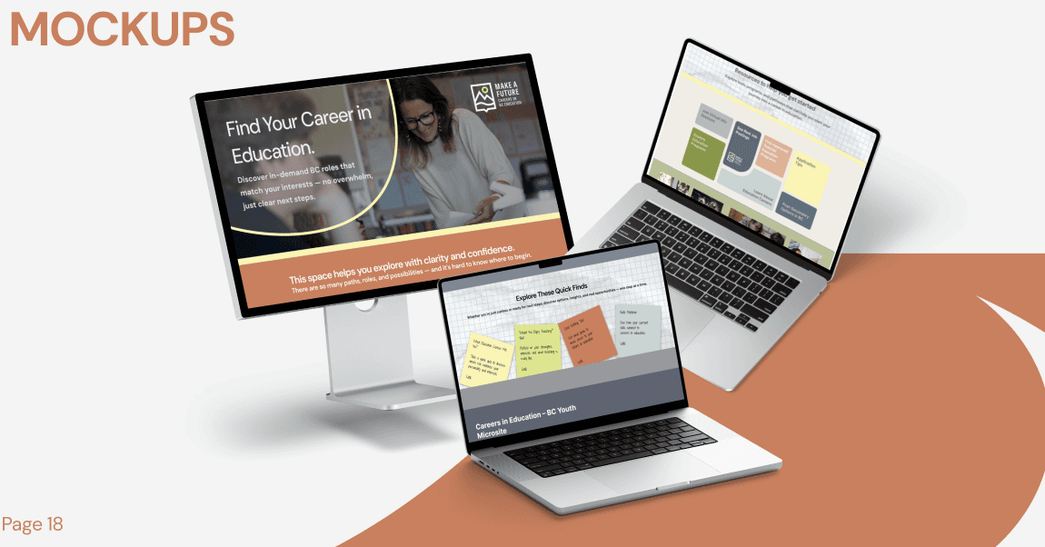
My solution to engage with this audience is to create a microsite in collaboration with Make a Future that is a low-pressure, engaging space for early career exploration in education. It brings guidance, inspiration, and resources into one place, making the discovery process simple, intuitive, and approachable.
Research
The research Goal → Understand how youth explore careers and where they feel lost or overwhelmed
Methods Used:
Interviews
Surveys
usability testing
some key insights gathered from our interviews and survey data.
Insight: Personalized guidance and relatable interests significantly increase engagement and clarity.
Evidence: Participant shared, “Seeing a interest of mine in that role really made it click and I could imagine myself there.”Insight: Lack of structured, interactive resources causes students to delay or avoid career decisions.
Evidence: A participant noted, “I keep putting it off because I can’t find a way to figure out what fits me without getting lost in endless websites and lists.”
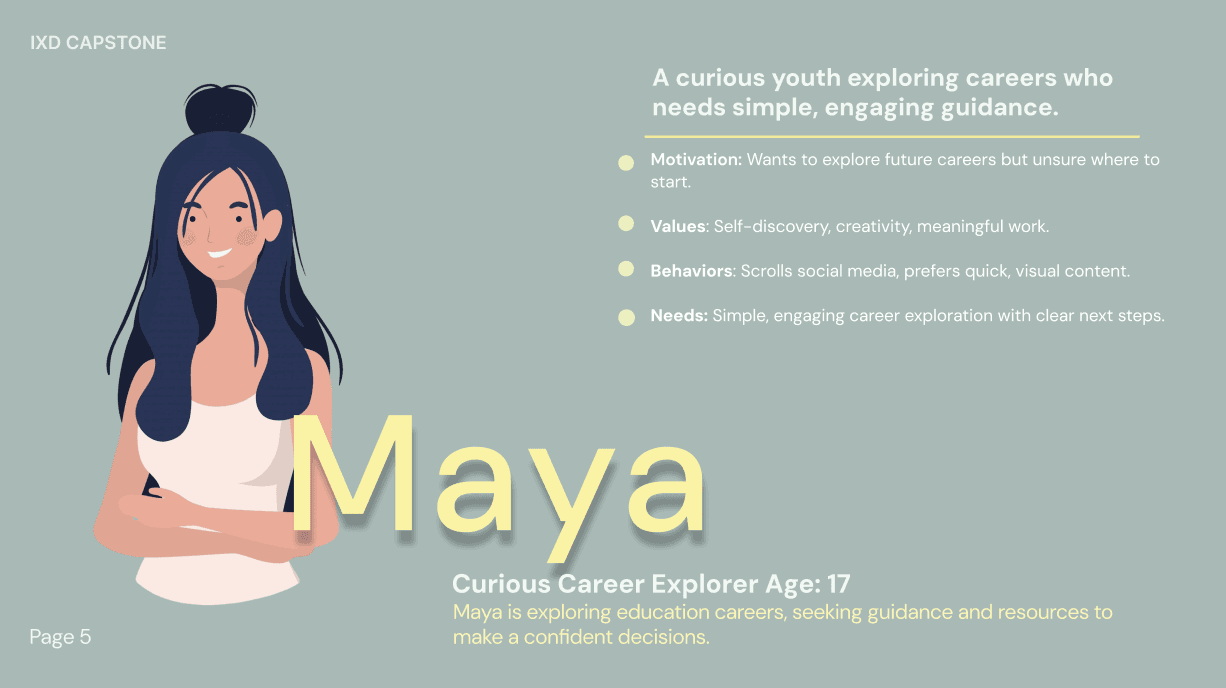
Persona of target audience
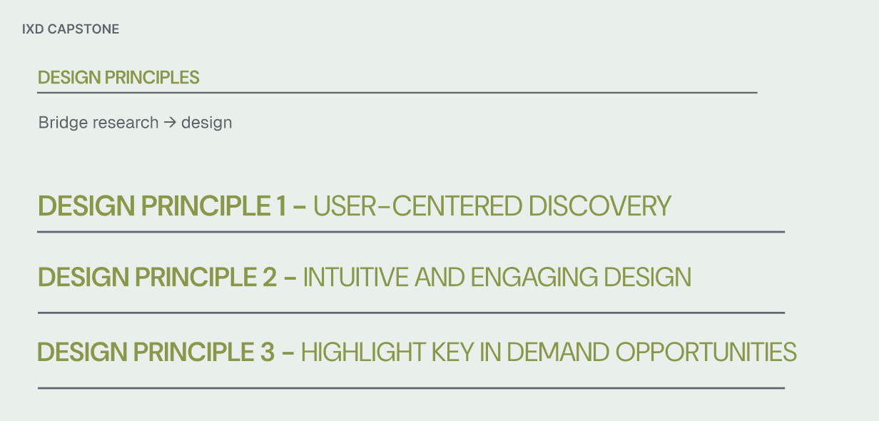
Design principles
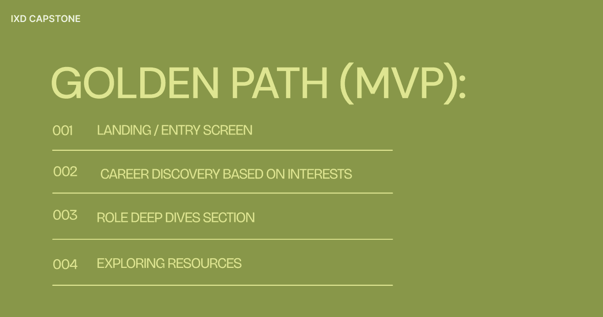
The Golden Path
Each of these sections plays a crucial role in guiding users from curiosity to action.
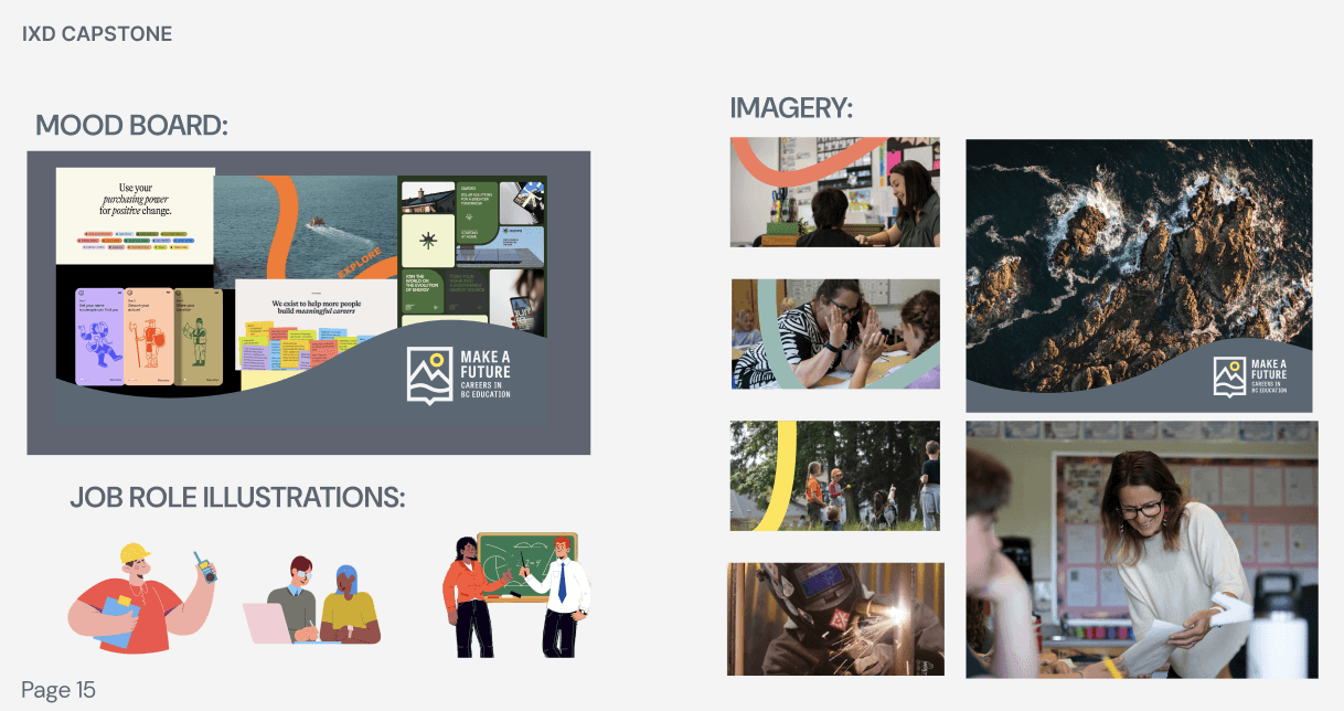
Visual Element Ideation
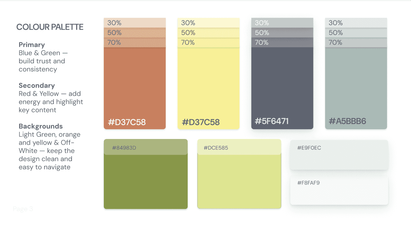
Colour palette
The colour palette was crucial for maintaining brand consistency. Keeping Make A Futures colours but brighting them to be more engaging.
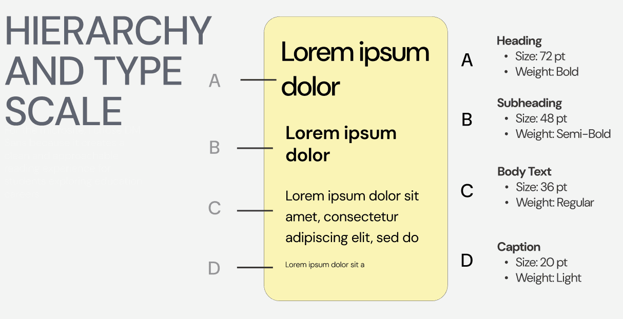
Type scale and hierarchy
DM Sans picked for its clean and approachable reading experience. The type scale includes various sizes and weights for different text elements:
Solution
Some of the challenges i encountered were Balancing real, informative content with a fun, scrollable microsite experience, Translating research insights into actual design decisions and Making the microsite feel connected to Make a Future while still having its own identity.
Simplified content reduced confusion and decision fatigue. Brighter, playful visuals improved engagement. Small UX choices greatly impacted motivation and clarity.
DISCOVER MORE