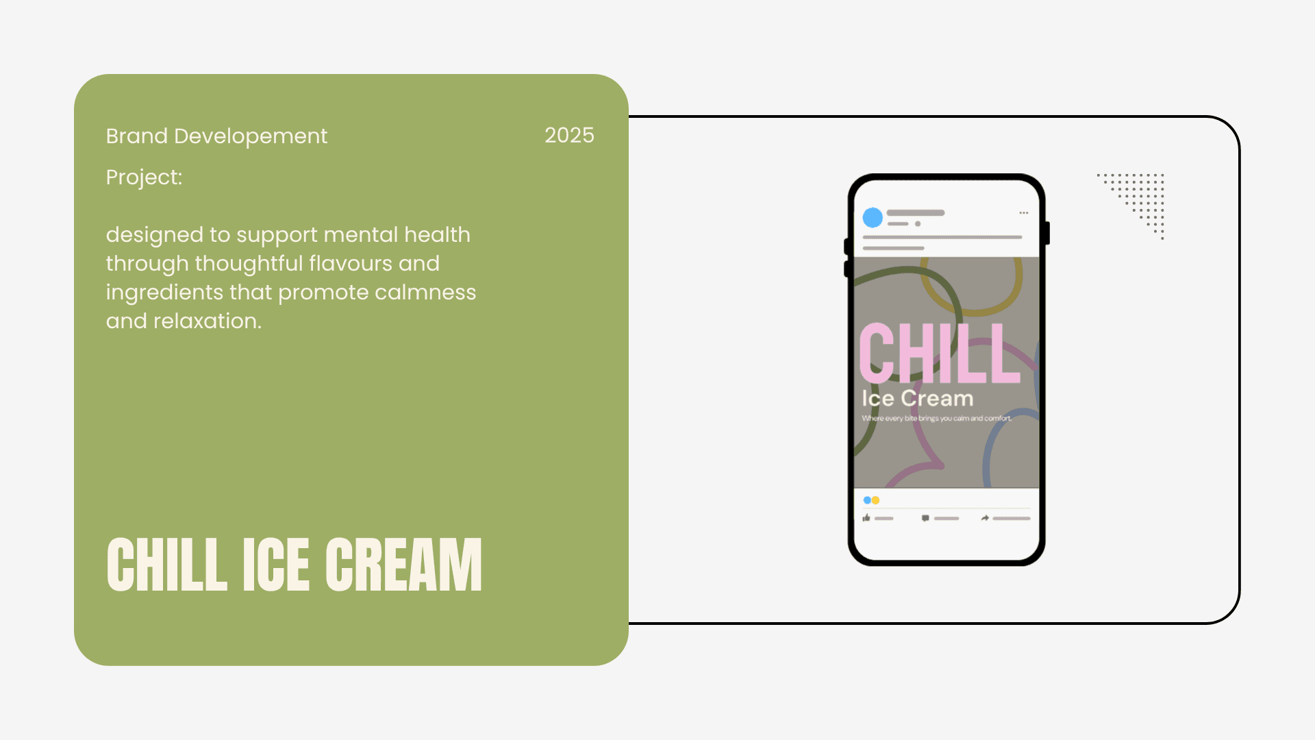
Where every bite brings you calm and comfort.
CHILL reimagines an ice cream brand for busy, neurodivergent young adults who want moments of calm without sacrificing fun. The project deliverables included brand strategy, audience definition, identity, packaging, social content, and a responsive website concept presented as a short investor‑style pitch. The brief emphasized clarity of the brand’s why, differentiation from competitors, and a strong through‑line from strategy to visual execution.

About this project
CHILL is an ice cream brand that transforms the act of enjoying ice cream into a moment of mindfulness.
I Mastered crafting a cohesive, accessibility-first brand identity, from strategy and design system to multi-touchpoint mockups, translating user empathy into scalable, investor-ready visuals
Many ice cream brands lean heavily on loud visuals, which can feel overwhelming or child like for young professionals seeking comfort and sensory ease. This created an opportunity to position CHILL as a gentle, sensory‑considerate alternative that still feels joyful and social. The brand needed to communicate calm, inclusivity, and indulgence in a way that was quick to understand and easy to apply across digital and physical touchpoints.
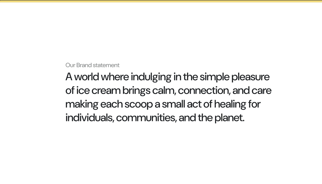
Brand Statement :
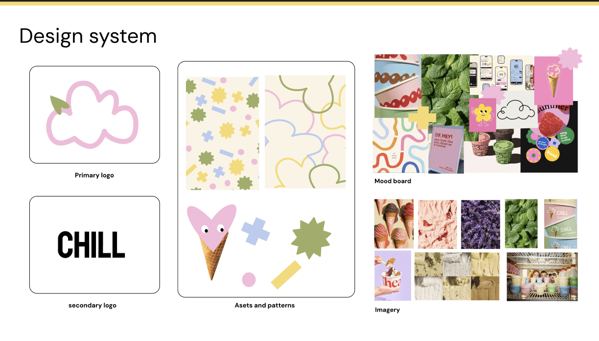
CHILLs Design system
Designing a brand that supports mental health in a playful way
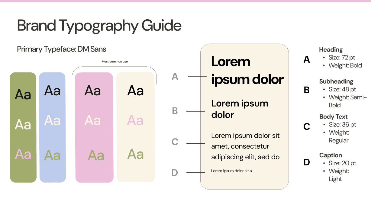
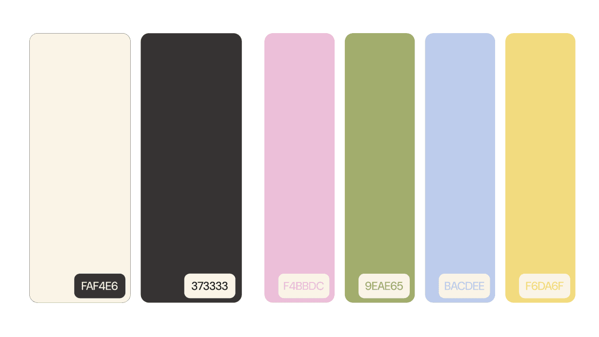
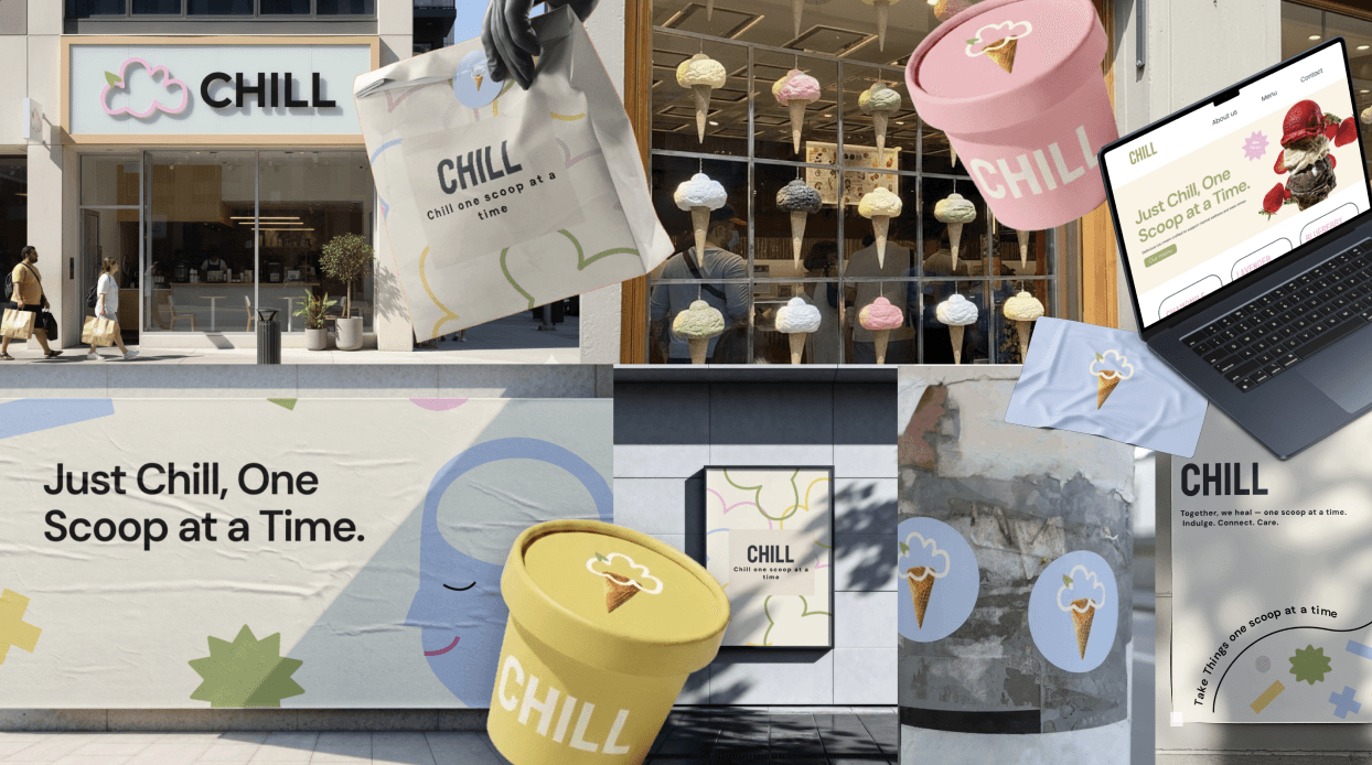
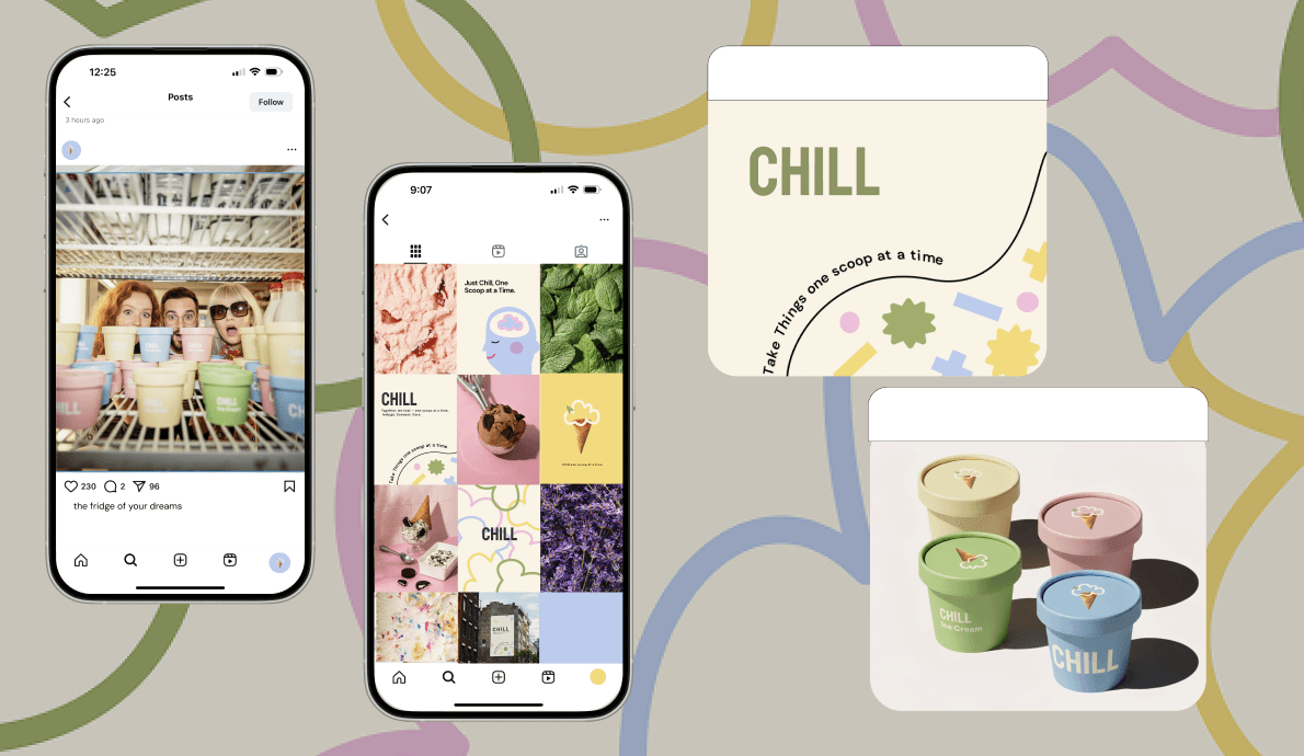
In response to the brief’s requirement for a unified design system, CHILL’s visual language uses soft pastels, rounded typography, and simple iconography that can scale from packaging to UI components. Ensuring consistency across packaging mockups, ads, website layouts, and social posts while keeping the experience light and approachable. This system also supports accessibility by maintaining sufficient contrast, clear hierarchy, and predictable interaction patterns across screens.
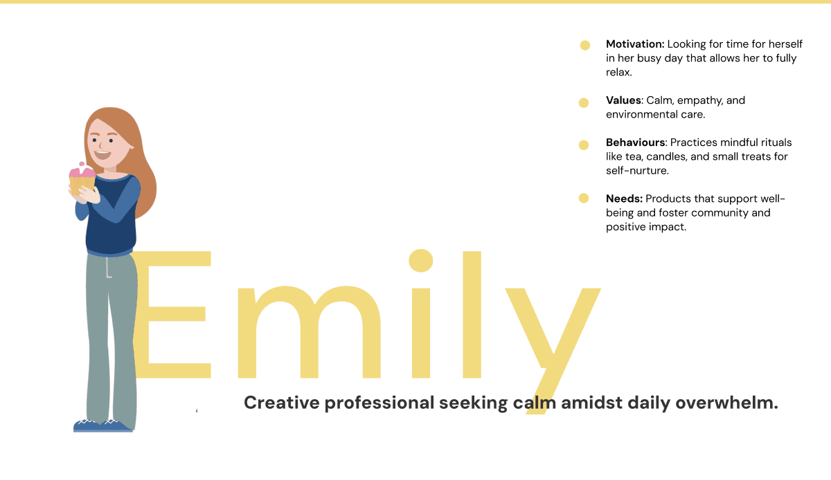
Persona of target audience
Visual Direction
Design system with art direction and assets
Brand Typography Guide
Colour palette
Reflection
Mockups and social media
What I would do differently next time…
Next time, I'd conduct early user testing with neurodivergent participants to refine Emily's persona and validate soothing interactions before final mockups, ensuring even stronger emotional resonance across touchpoints
DISCOVER MORE